Request Portal App Redesign
Company & Year: Bristol Myers-Squibb, 2019
Intro: ARIA is an Application for Requesting In vivo Assay (ARIA) for use by various in vivo groups at BMS R&D Biologics department

Project Overview: ARIA will be used to submit electronic requests for performing in vivo studies at BMS. The requests will be submitted by the investigators and Pharmacology heads can edit and/or prioritize or reject the request. Investigators and other users can upload any associated documents such as reference articles, study design, study results etc as additional information to support the request.
My Role: Senior UI/UX Designer. Visual design.
Goal: To redesign the app and clean up the application clutter
Problems:
- Submitted requests were not categorized based on study
- Who will run the study was not clearly known
- UI for Prioritizing and rejecting studies seemed complex
- Overall app layout and request form needed to be simplified
- Lack of white space on the UI
- Multiple navigation options available to modify requests
- Self navigation on the app was difficult to track studies
- Common data repository was not efficiently searchable
- Redundancy of date entry would improve the visibility of the study
- Request form was missing information
User Research & Usability Testing Insights:
- User research was conducted to better understand users’ preferences and define what a successful system should enable the team to accomplish
- The usability tests were conducted for approximately 1 hour in which participants covered between 2-3 tasks depending on their role
- Multiple test scenarios were created to identify task actions and change requests
- A System Usability Scale questionnaire was provided after the Usability tests to assess the learnability and usability of the system
- Recommendations to simplify and unclutter the UI layout and were made based on the research and testing

Design Process: As per the recommendations from the user research and usability testings, I made following design updates to the app
- Changed the look and feel of the homepage, layout and mast head
- Action items were highlighted to create a sense of urgency
- Search functionality and design was improvised. Generated search results were grouped and categorized based ons search criteria
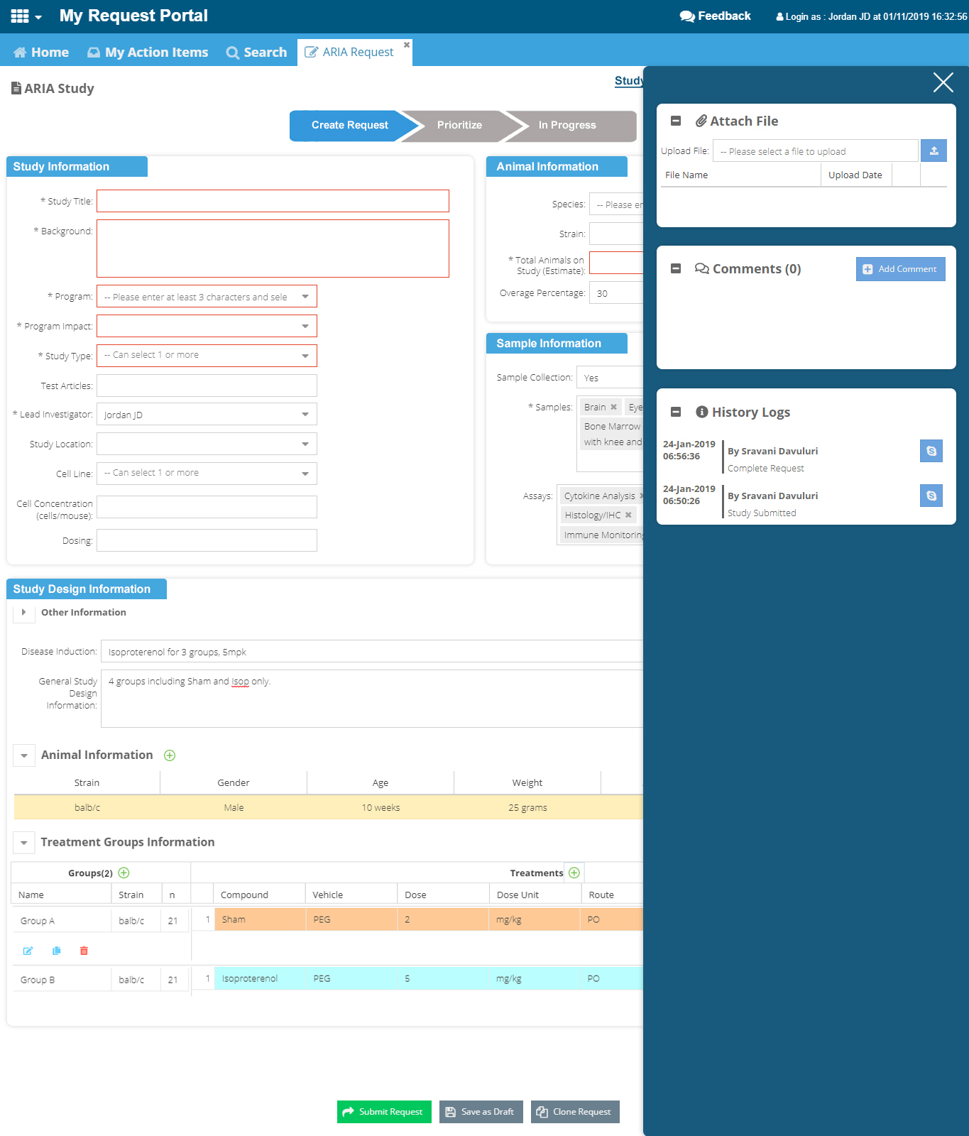
- Slide panel tray was created for information not immediately needed by the users
- Switching between user roles was implemented
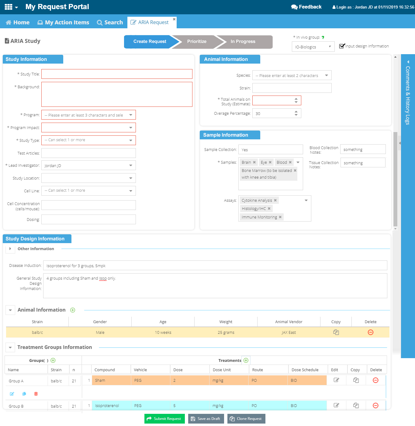
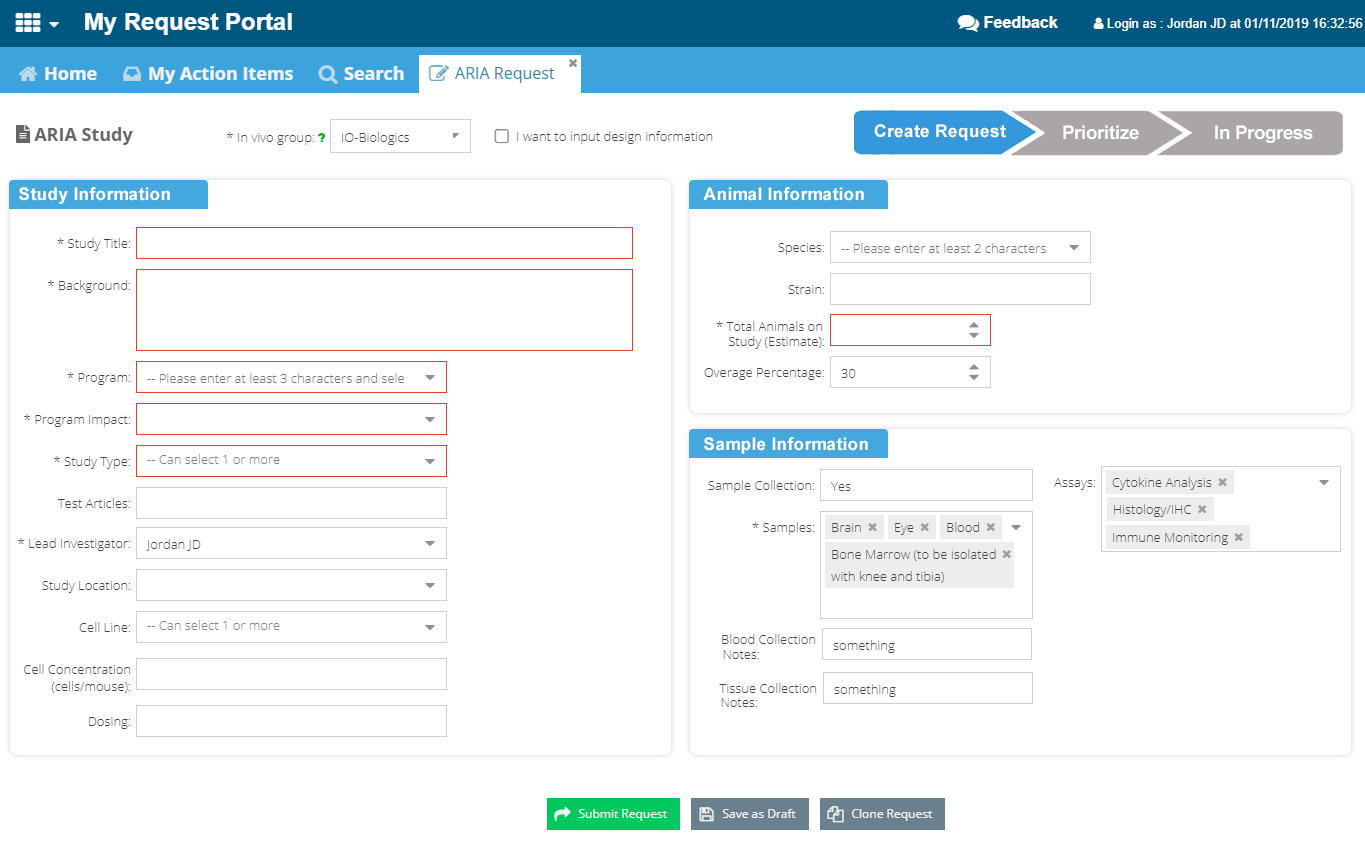
- Fields on the Request form was revisited and data was intuitively presented
- Look and feel of the boxes and headers were modified
- Cleaner fonts and layout was implemented throughout the site
- Padding between UI elements and white space was applied to improve readability and clarity
- Status changes were color coded
- Relevant breakpoints were added to make the site responsive

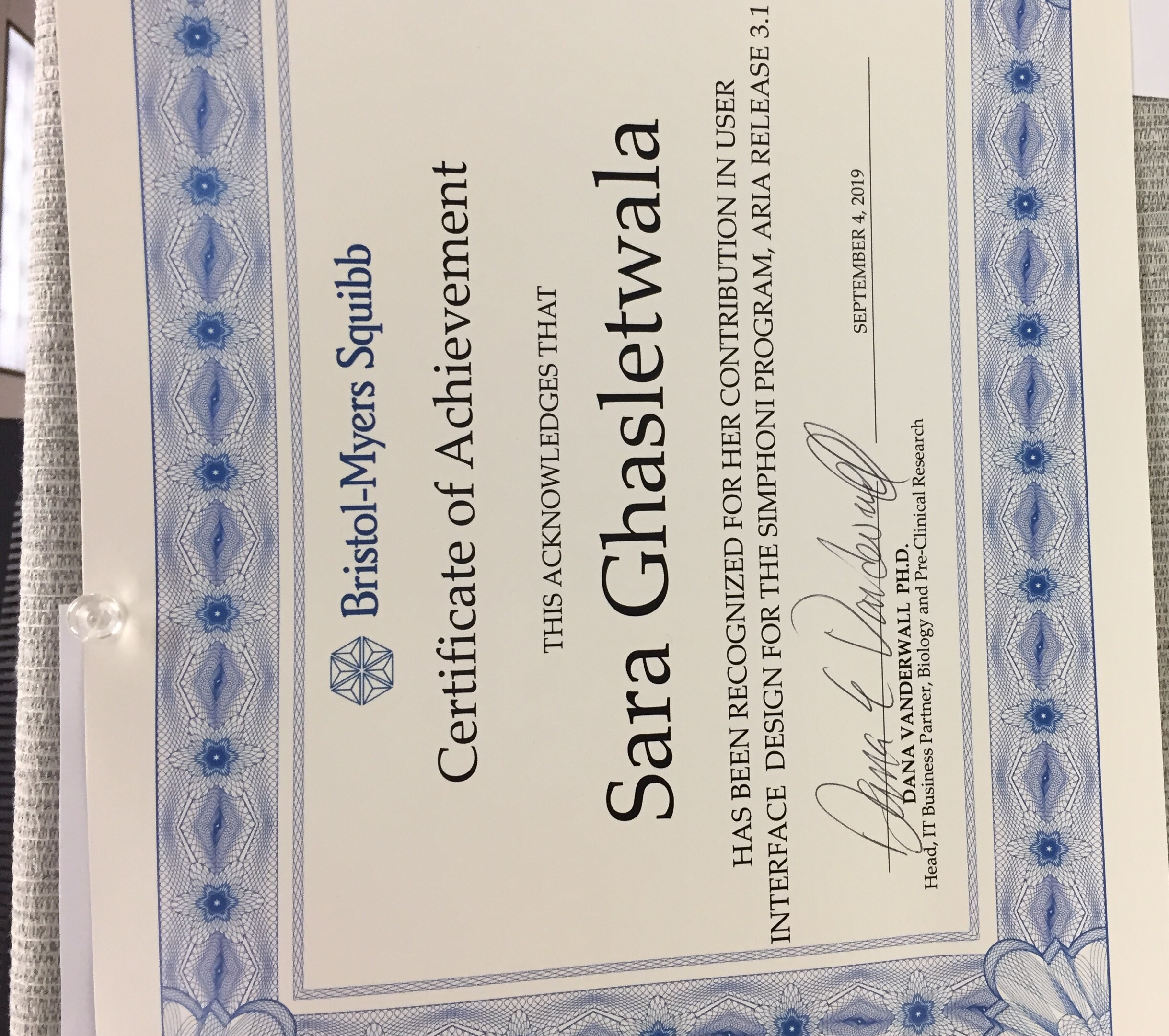
Results: Designing intuitive interfaces simplified the UI and day to day request tasks. I was recognized by the team for my efforts in UI/UX Design
 My experience with this project also taught me the business processes used by IO-Biologics and Resistance Group at BMS