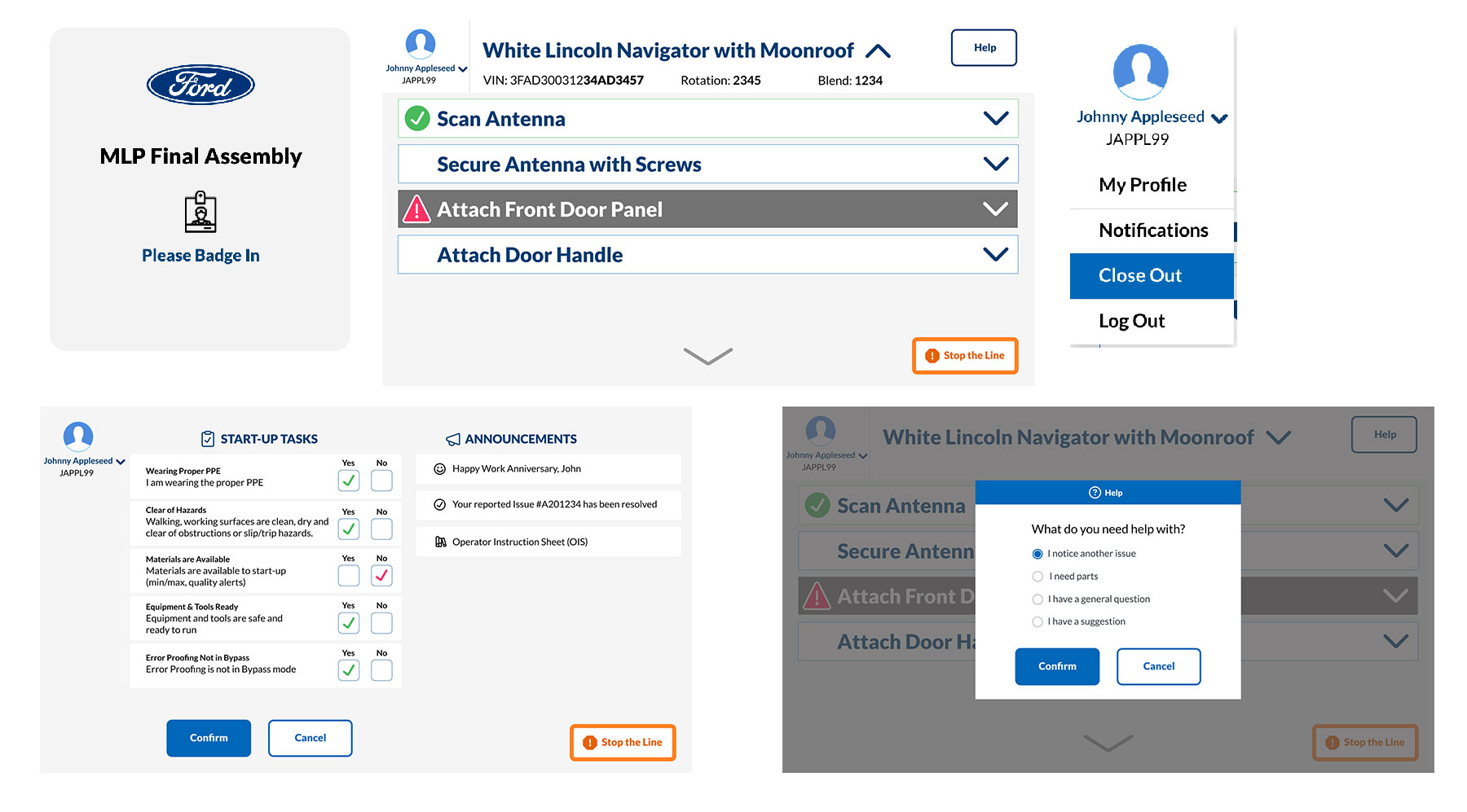
Workstation Operator Touchscreen App
Company & Year: Ford Motor Co. 2023
User Persona: Operators are hourly personnel who are assigned specific assembly tasks at their “workstation” in a manufacturing plant.
Project Overview: Workstation Operator Touchscreen WOT is an app designed for operators to perform their tasks at their workstation in an assembly line. This app is accessible on a 24 inch screen.
My Role: Senior Human Centered UI/UX Designer. Design Thinking, Interaction design, Visual design, Wireframing, Prototyping
Goal: Design a touchscreen application that reduces stress and cognitive load for plant floor workers, while improving quality and other metrics for the organization.

Challenges:
- Operators are vulnerable to adopting changes in technology and newer experiences
- Too much information is available on their current screens
- Operator tasks are not intuitively presented
- Current systems do not account for accessibility and people with limited vision and color blindness
- Operators will access the screens with gloves on
- Badge in and startup tasks list isn’t clear
- Operators need team leader help for mechanical issues and parts replenishing
- Helpful alerts, reminders and task notifications are missing
- Learning and training videos unavailable
- Time consuming paperwork
Qualitative Research:
- My UX team visited the Ford manufacturing plants in Detroit
- We conducted in-person interviews with plant floor operators to learn about their needs and what information on the app would be beneficial to them
- Collaboration sessions with UX team to evaluate findings and turn them into deep insights.
- Held concept generation sprints to help tell the story of ‘why’
- Conducted usability testing to identify problems and areas for improvement
- Conducted user research and data analysis to influence design decisions
Design Principles: Design Thinking helped me design products, services, and processes by understanding and focusing on the problems from a customer-focused perspective. This helps us ensure that generated concepts are desirable to the users. After concepts are generated, they will be evaluated for feasibility and viability.
- Continuity – The experience we create should stand the test of time while still being adaptable to new technology and design trends.
- Intuitive – The designs should be user-friendly and incorporate successful modes of interaction (visual, haptic, aural)
- Simplified – At minimum, reduce complexity and “information noise” (provide only relevant info)
Design Process:
- The team held concept generation sprints with users to learn about the product offerings and how users will respond to it
- Helped my UX team to craft powerful presentations to communicate a vision for the future that is tied to the reality on the ground.
- Interactive prototypes were built to explore and present the product functionality and receive feedback
- Created low and hi fidelity designs for all the required screens
- Focused on alignment and intuitiveness of UI elements, speech and voice technology
- Accessibility, screen contrast colors, larger fonts were adopted for better readability from afar
Design Hand-offs and Development:
- Created UX annotations, functional specs and dev notes to ensure development team receive required handoffs
- Timely communication with development team to ensure there is no design related constraints for them
- Created style-guide, and helped in CSS styling to ease development building pressure